Primary typeface
Helvetica Neue LT Pro
The primary brand typeface (also known as a font) that we use in materials to promote Kent Fire and Rescue Service is Helvetica Neue LT Pro.
Use either the primary or secondary font types, not both at the same time. Only use the typefaces detailed in this document.
For ease, we’ve selected a few weights on this page to show how the primary typeface can be used. However, you don’t need to use the examples referenced.


Secondary typeface
Arial
Our secondary brand typeface is Arial. This is used for internal communications, documents and emails. It can also be used for promotional materials if Helvetica Neue LT Pro is not available.
Do not use both fonts simultaneously in the same document or content.
See example below demonstrating weights and usage.


Our digital typeface is Open Sans
On some occasions, the primary and secondary fonts will not be available for online use due to licensing or compliance considerations. In these cases, the open source* font Open Sans should be used.
Open Sans is also designed as a ‘digital first’ font, which means it is better suited to display on a screen or projector than traditional fonts that were designed to be printed out.
*Free software available to download for public or business use.


Typography dos and don’ts
Below you will find guidance on how to correctly layout and display your written content.
The information here is shown in Arial font, as this is what you will use for emails and documents.
By having what is known as a typographic hierarchy with different settings for different sections (Headlines, Standfirst, Subheadings and Body copy) it will also make your content a lot easier to read.

Below provides further guidance on the correct use of typography to ensure your content is easy to read.
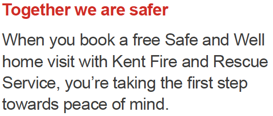
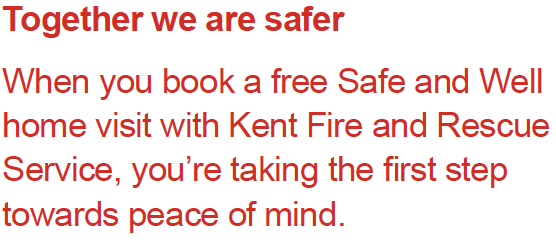
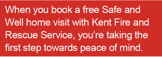
- Use red sparingly for headings, subheadings and pull quotes.
- Don’t use it for long sections of body copy.

- Set body copy in black or off‑black. Off black is more legible than using full black text in long passages of copy
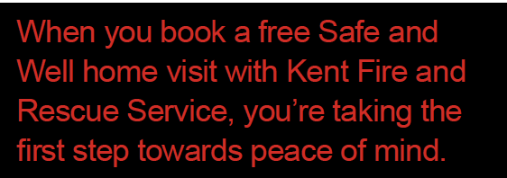
- Don’t use black on red for body copy, as it’s difficult to read.
- Avoid long sections of white on red as it can be difficult to read. As a general rule of thumb try to keep the amount of text to no more than a paragraph.
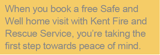
- Don’t use grey on black, red or yellow backgrounds.

- Grey on a white background can be used for headings, subheadings and standfirsts.