How to reflect our brand through imagery
Photography and illustrations are powerful and emotive tools through which to express our brand personality.
- Collaborative
- Innovative
- Compassionate
- Dedicated
Imagery style sheet
When selecting images to use, the following checklist provides a useful guide. Ideally, our imagery should:
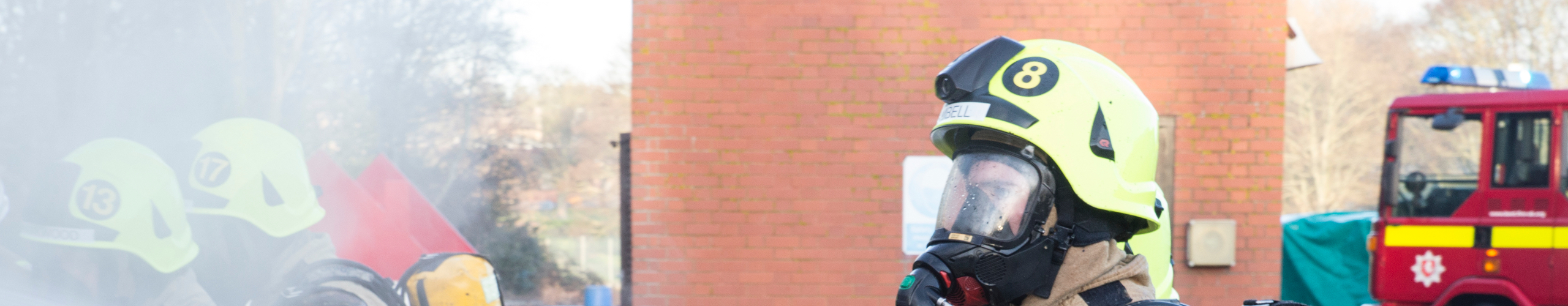
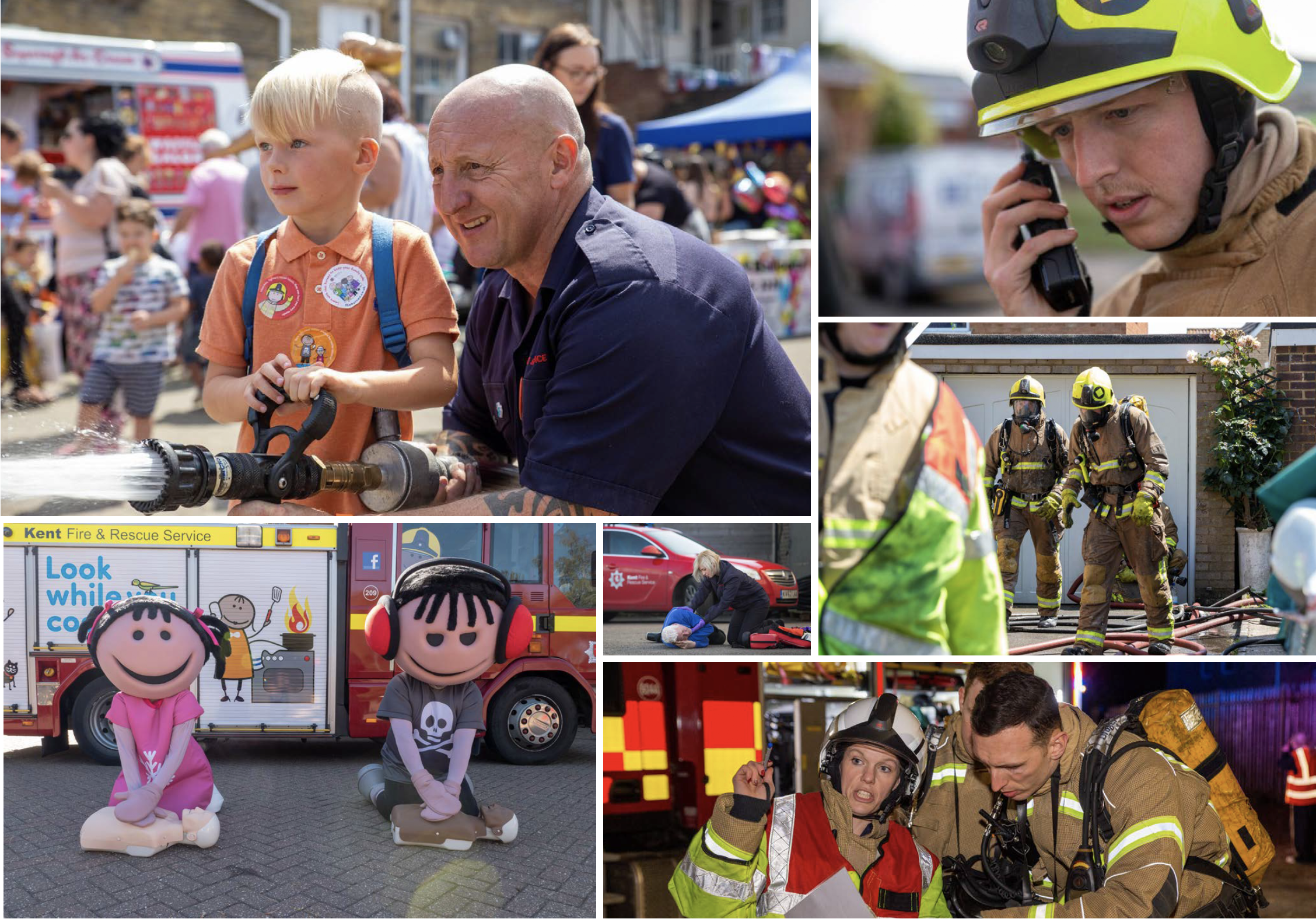
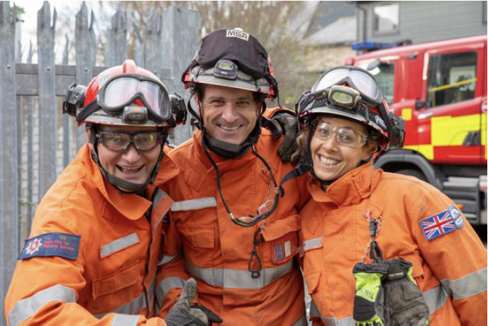
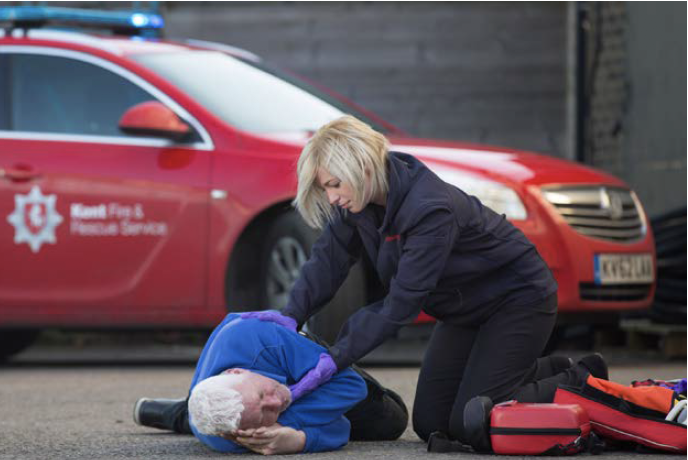
- have eye contact
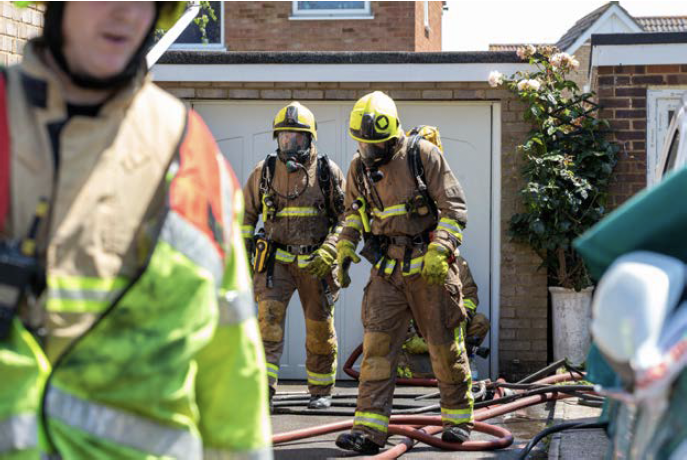
- include recognisable fleet livery
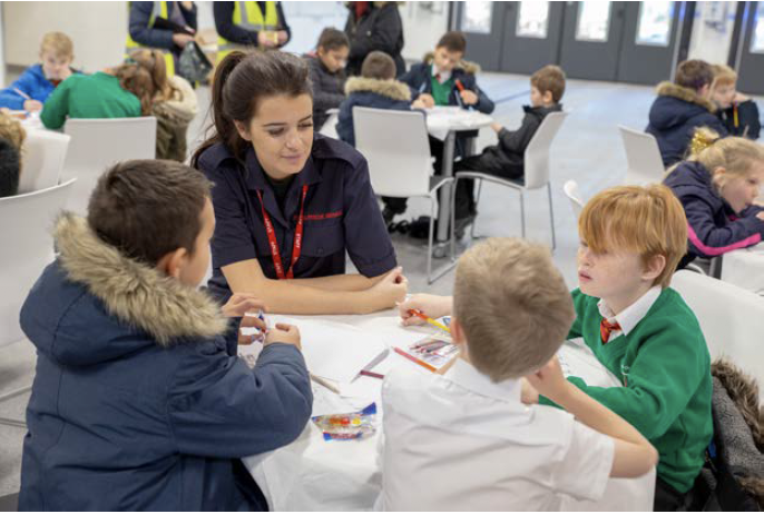
- include examples of members of our service and customers working together
- show the service sharing expertise
- include the brand core colours for example blue against red and vice versa
- be taken in their natural environment
By using good quality images that follow the criteria listed above, it will properly reflect who we are and contribute positively to how we are seen as an organisation.
- Focus on brand colours
- Eye contact
- Recognisable fleet livery
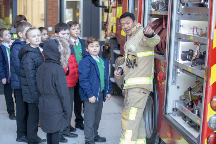
- Show the service as educators
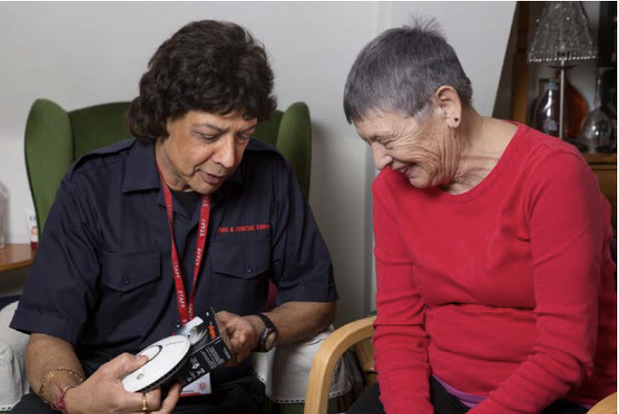
- Working with our customers
- Natural environment
Video and animation
The importance of video and animation to marketing Kent Fire and Rescue Service as a brand cannot be underestimated, so it’s important to get it right to ensure we look our best. Below, are a number of tips to help you produce great content.
Talking head guidelines

Eyeline and subject positioning
Central framing and camera eyeline
Talking directly to camera can be unnerving but can be effective when a more personal touch is required. This style is useful for getting across safety advice in a way that people watching can relate to. This often draws a more emotional response. The person talking should be central in the frame, observing the rule of thirds (as shown to the left).

- Left framing

- Right framing
Left or right framing
This traditional style of filming still has its place with the person talking looking towards the one asking the questions. Left or right framing is effective when the content is more conversational or there is a need to explain something in more depth. Which side of the camera the interviewer is standing will dictate which side the interviewee stands on.
The subject should look toward the person interviewing – not the camera.
The checklist below shares advice on logo position, layout colour and use of typography.

- Use our primary colours for the background.
- Position all content within the title ‘safe’ area as indicated by the lorem ipsum text.
- Position the logo centrally or in the corner, depending on content.
- Ensure the content and call to action are clear and easy to read.
- Try to limit the number of items on a slide to three.
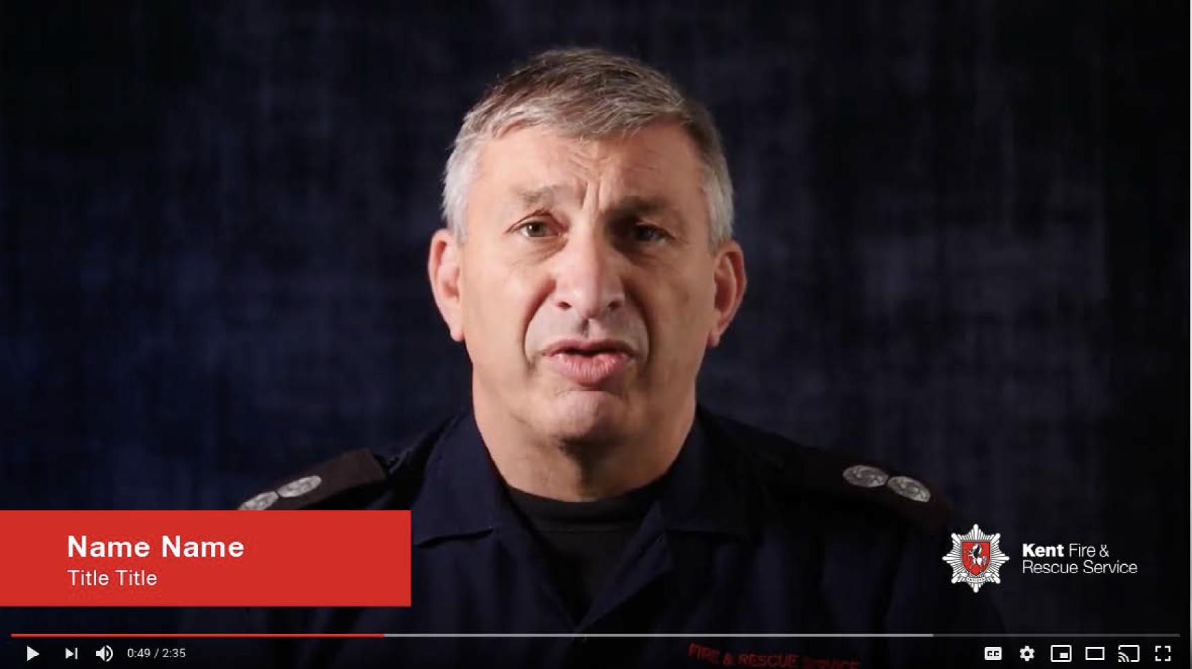
The checklist below shares advice on logo position, lower third rules and subtitles.
- All our video and animation content should be created following our tone of voice and our key styles of written content.
- Display the Kent Fire and Rescue Service logo for the duration of the video in the bottom right hand corner.
- The lower third content (the name of the interviewee show above for example) uses our brand colours and typography.
- Subtitles should be centred on a black background at 85% opacity (unless auto-generated by social media platforms).