Instant recognition
Red and blue are the colours most people associate with Kent Fire and Rescue Service. They continue to be our core colours, supported by other colours where required.
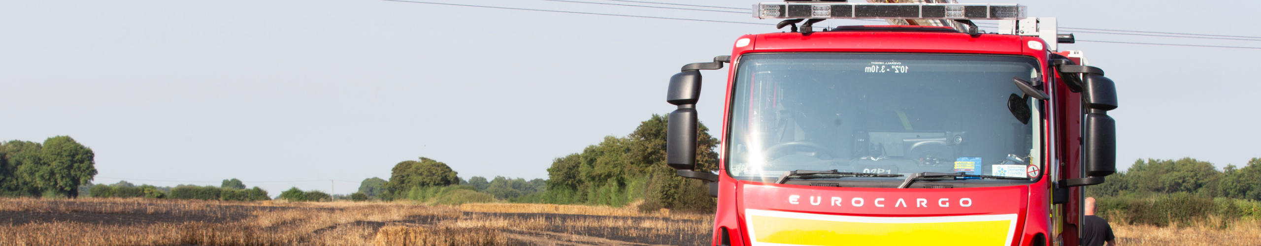
Historically, the red was linked to the colour of our vehicles, and blue associated with the colour of our uniform. Together they still create instant recognition when communicating the brand with our customers.
These core colours are supported by secondary colours. These are all used for specific purposes, which we explain below.

- Our red should always be the dominant colour followed by the blue. This ensures that anything content we produce is instantly recognisable as Kent Fire and Rescue Service.
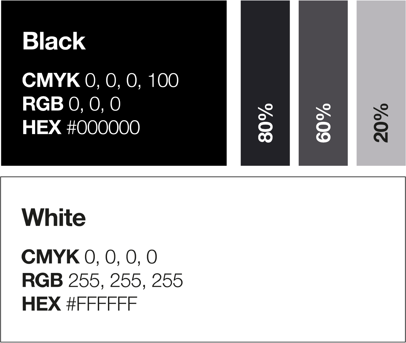
- These neutral shades help to support the core colours of red and blue. Black and dark grey can be used for type. Tints of the black can be used as background for content when appropriate. White is, of course, the most important neutral base. Together they will support the overall blue and red look, if used correctly.

Our supporting colours
There will be times when we can go an extra step with colour. This can add diversity and a visual pointer to a campaign or specific aspects of the work of Kent Fire and Rescue Service. For example, turquoise could be used to promote the work of our volunteers. The secondary colour would immediately be associated with that content theme.
However, it’s important to not overuse or dominate at the expense of our core colours. That way customers viewing content will still recognise the brand.
